Thursday, 19 December 2013
Triple H 1000 Word Article
These are the first two pages of my article for my music magazine.
These are the last two pages of my article for my music magazine.
Monday, 9 December 2013
Friday, 6 December 2013
Chosen Images For My Magazine
Thursday, 5 December 2013
Planning For Photographs
When planning to take the photographs for my music magazine, I had to keep in mind the genre of my magazine, which was hip-hop, and ensure that the locations and props used helped reinforce the idea that my magazine belonged to this genre.
The locations I used were the skate-park in mile end, which had several graffiti walls. This was perfect as it highlighted the genre of hip-hop as it is in such places that legitimate hip-hop photo-shoots and music videos are shot. Additionally, I had some photos taken outside Canary Wharf, due to the location looking quite spectacular at the time of shooting and also, the pond by mile-end.
The significant props were all based on clothing, with some of my artists wearing snapbacks, turtleneck jumpers and other pieces of clothing which help indicate that they belong to the genre of hip-hop.
The media equipment I used were a digital camera and camera stand.
Monday, 2 December 2013
Tuesday, 26 November 2013
Peer Assessment
These are the feed-backs i received on my front cover and contents page from two of my class mates. I am going to act on this feed-back through making adjustments to my front cover and contents page.
Wednesday, 20 November 2013
Magazine Contents Page Mock Up
I also had to make a draft for a contents page for my magazine. However, i used illustrator instead of Photoshop when creating this.
Magazine Front Cover Mock-Up
We had to create a draft for our music magazine front cover. i created my front cover using Photoshop.
Wednesday, 6 November 2013
Double Page Article Mood Board And Analysis
Here is a mood board involving a mixture of double page
articles from different types of music magazines. After doing some independent
research, I can state that the conventions are:
·
Certain letters which are of different font, colour, or size to
the rest.
·
A consistent colour scheme.
·
Central images cut out from background or blended into the
background.
·
Page numbers in the bottom corner.
·
Quotes
·
Titles
u
[
Here is a
double page spread from a Hip - Hop Connection magazine article.
The first
thing that attracts the reader’s attention is the full page picture of a well-known
rapper, from the "Wu Tang Clan", GZA.
The heading
states 'Pure Genius' and the sub - heading mentions that without GZA the Wu
Tang Clan would not be as 'big' as they are now. It says he 'Still has
creativity to burn' implying that he really can take the Wu Tang Clan a lot
further in the industry.
The colour
scheme and font style are the same as seen on front cover of any Hip - Hop
Connection magazine, and therefore it may even be seen as iconic of this
magazine.
One page has
a picture, and the other, information related to this picture. In this case it
is a picture of GZA, and the information is about his rise to fame along with
the Wu Tang Clan.
For the
reader, it would be a lot easier to understand what this article is trying get
across if they already know who GZA is.
p In the
magazine above, the artist is looking away from the source of the light. The
page number and ‘streetz’ is on every page. The gold colouring used in the text
‘Fiasco @ 9:30’ contrasts with the black background. It also matches the
artist’s clothing and jewellery. The information in this article has been put
into columns in order to make it easier to read and understand. The quote
consists of some words in different colour in order to highlight which words
are important.
k The magazine above is based on two of the biggest stars in
arguably the world’s favourite boy band, One Direction. You could say that this
makes it easier for the writer to present his article as most people will know
who they are and so understand things in relation to the article which they
otherwise may not have if it had involved an unknown artist. We see two
separate images of them cut out from a background and literally placed on the
pages. The colour scheme of light blue, white and grey seems to work extremely
well, as the colours complement each other nicely. Their respected names “Zayn”
and “Harry” are in a unique font and all the headings are in light blue, which
helps for it to stand out. Additionally, the quotes are in a huge font for the
exact same purpose.
Tuesday, 5 November 2013
Contents Page Mood Board And Analysis
Here is a mood board involving a mixture of contents pages
from different types of music magazines. After doing some independent research,
I can state that the conventions are:
·
House style
·
Page numbers
·
Trendy clothes/accessories
·
The writings are set in different fonts and
colours to each other to help it stand out.
·
One image is always bigger than the rest
·
Consistent colour scheme
In The Source’s contents page, in which the central image is
of Ice Cube, a close up is used. The idea behind this is to display the aggressive
expression on his face, which in a way portrays the kind of rap music the
artist does. Additionally, the artist’s face is being faded by the dark
background, with the intention behind this being to reveal the dark side of
hip-hop. The name of this magazine, ‘The Source’, has been placed at the bottom
of the magazine as oppose to the top, as the creator wants the audience to be
more attracted to the image instead of the masthead. The date and issue number
of the magazine is in small print beneath the name of the magazine. The house
style is very dark and deathly. These set of colours match with hip-hop’s unforgettable
sell-line ‘Hip-hop is dead’.
[ From Q’s double page contents, we see the use of more than
one image. However, the images are not of the same size or shape, as if it were
it would appear quite boring. We can clearly see how the magazine intentionally
made their page numbers quite huge and bold. The purpose behind this obviously
being to make the numbers clear and stand out. Furthermore, the colour scheme
is red and white. The colours complement each other nicely, and give off
contrasting looks of danger and brightness.
The contents page above contains 7 images, with one image
being larger than the rest. This is because the bigger image is of the main
artist for this magazine and so the magazine is trying to gather all attention
towards that artist. Moreover, the text is set in neat columns, which means for
an organised look and proves quite appealing to the reader, as they can easily
read and find what they are looking for.
Monday, 4 November 2013
Front Cover Mood Board And Analysis
The camera shots
used in the magazine front covers above are low angle, medium and two shot. The
front covers featuring Jay Z and Ciara both consist of low angle shots in order
to highlight the superiority of the two artists. Medium shots are used in the
magazine front covers containing Eminem and Chris Brown. The purpose of a
medium shot is to reveal both the artist's facial expressions and body
language. Finally, in relation to camera shots, a two shot is used in the front
cover, which has Macklemore and Ryan Lewis in order to show the relationship
between them.
The outfits of the artists in the front covers above have
different types of impacts. In the magazine involving Ciara, the only items she
happens to be wearing are high heels and so more or less, she is completely
naked. This is effective as it is seen as attractive and may attract more
people towards the magazine (Sex appeal). Additionally, high heels are seen as
seductive and so it being the only piece of attire she is wearing highlights
the magazine’s ambition to make Ciara come across as sexually appealing as
possible. The other front covers in the mood board above are of male hip hop
artists who are in similar clothing. They come across as cool and sort of
rebellious through the colour black in their clothing.
The overall representation of the magazine is heavily
influenced by the artists on the front covers. The artists above come across as
dominant and quite ‘hard’ through their body language and facial expressions.
This reflects the representation of the genre of music in the magazine as it
tells us the music will most likely be hard edge, which is what we can expect
from hip-hop.
The font styles of the title blocks are quite bold and
vibrant. The purpose of this is to help the magazine stand out. Additionally,
the bright colours help the magazine to look more glossy than dull, as if a
magazine looks dull; it wouldn’t attract as many people. Also, the title blocks
being bold represent the genre, as hip-hop is quite bold in relation to the
style and pace of its music.
The colour scheme used in the magazines is reflective of the
genre of music. Dark colours, black for instance, are frequently used to
reflect the hard edged connotation of hip hop. Additionally, some bright colours
are used, like red and yellow, as it contrasts nicely with black and also to
stop the magazine from being too dull.
The types of articles found in the magazines are revealed to
us by the puffs. The puffs are quite bold and reveal to us what will be involved
in the magazine. Some of the puffs tell us that there will be inside stories
based on a certain artist, while others reveal new music and reviews on them.
Thursday, 17 October 2013
My Chosen Title Block
I've decided that this will be the title block for my
magazine, even-though it was the second most voted for title design out of the
four designs that I put up to be voted for. The reason why I’m choosing this
over the most voted for design is that the winning design of the poll is
displayed as ‘H.H.H’, instead of ‘Triple H’. I came to the conclusion that the
title ‘Triple H’ would be catchier and more suited than ‘H.H.H’.
Tuesday, 15 October 2013
Title Block Analysis
From the
title above, it is made clear that the genre of music that the magazine will be
based on is ‘Rock’. We know this because, the title of the magazine is ‘Rolling
Stone’, which happens to be a ‘Rock’ based group. Furthermore, the colours used
in the title are red and grey, in which red is the main colour and grey is used
as the 3-D fill in the title. The colour red has been used to highlight the
genre of music that the magazine is about. Red gives off connotations of danger
and comes across as quite bold, which backs up the genre of rock. Also, the
shade of grey in the outline of the title adds effect and helps the red in the
title to stand out more. Moreover, the font used by the title appears as quite
authentic through the flicks used in the letters ‘R’ and ‘g’. The purpose of
this is to maybe catch the eyes of more people through the attractive font of
the title. The font adds class to the magazine and might sway a customer’s
thoughts into thinking that the magazine is of high quality. The title itself
tells me that the magazine will clearly be based on rock related groups. This
is due to the fact that the ‘Rolling Stones’ happens to be a really popular
rock band. The title supports the genre of rock, as the title of a pop, or a
different type of genre related magazine would not be named after a rock based
group. Additionally, the title gives us the impression that the target audience
of the magazine are rock fans, simply due to the fact that the name of the
title is based on a rock group.
From the
magazine title above, it is hard to tell what genre the music magazine is about
as we aren’t given much information from the title. However, the colours used
imply that the genre of the magazine might be pop. This is due to the colour
pink being a colour mostly associated with pop, as oppose to other genres such
as rock or hip-hop. The colour pink also tells us that the magazine might be
quite feminine, seeing as pink is a feminine, or girly colour. Additionally,
white is used for the solitary letter in the title to help both the letter and
the background stand out. In addition, there happens to be quite a nice and
attractive contrast between pink and white. Furthermore, the font used in the
title is very bold. This could be to make up for the fact that there is only
one letter in the title (Q), or in fact, to emphasise the letter ‘Q’. it could
imply that the magazine will be quite bold. Once again, the title of the
magazine doesn’t tell the audience much as it contains only one letter. In
addition, it suggests that the letter ‘Q’ stands for something, and also, adds
a certain air of mystery to the magazine as the audience might be intrigued by
the single lettered title and so, want to find out more. Moreover, the magazine
title gives us the impression that the target audience for this magazine are
teenagers, who happen to be a huge percentage of the audience for pop. This
idea is developed through the main colour of the title being pink, which could
also indicate that the magazine is aimed towards females over males.
From the
magazine title above, we get the impression that this magazine covers different
types of music genres. This is because the magazine is called ‘New Musical
Express’, which quite literally suggests that the magazine covers new music,
whether it be rock, pop, hip-hop, or any other music genre. The colours used in
the title font are red, white and black, in which the colour red fills out the
letters of the title, while the outlines of the title are in white and black. This
highlights the colour red mostly, which happens to give off bright, bold and
sort of fiery connotations. Additionally, the white and black outlines contrast
nicely, helping the title to appear more attractive towards the audience.
Furthermore, the font used in the magazine is extremely bold. This makes the
magazine stand out and implies that the magazine will be quite vibrant in its
uses and detailed with effect. Moreover, the title of the magazine suggests
that the target audience will be people who are looking for fresh, brand new
music, as the title is ‘New Music Express’. It is from the title that we can
make the assumption that the magazine will be heavily based on upcoming artists
and new music.
Saturday, 12 October 2013
Final Magazine Proposal
For my final magazine proposal, I have concluded that the title of my music magazine will be Triple H, or HHH, which stands for Hip Hop Haven. From this title, it is made clear that the genre of my magazine will indeed be Hip Hop, as hip hop is included in the title. The audience I will be targeting consists of a mixture of different age groups. I will be aiming the magazine towards teenagers and young adults due to the fact that they are the age groups most interested in the genre of hip hop. In reference to gender, my magazine will not be aimed towards either male or female in specific. It will be a magazine for both male and female as the audience for hip hop doesn’t consist of just one gender. After reviewing the responses in my focus group, I’ve decided that my magazine will be released every fortnight instead of every week. This is because I feel it will benefit me more if my magazine is released every fortnight due to the fact that it will give me more time to develop new ideas. The reason behind making the release date every week was in order to keep the magazine frequent for the audience and not have them waiting. However, seeing as my magazine will be accessible online, the audience will be kept up to date no matter what so it is ideal to release the magazine every fortnight. Furthermore, the reason why I have decided to create this type of magazine is because it is the type which I personally would buy. My target audience is going to reflect myself as it is aimed towards teenagers and young adults and mainly hip-hop fans. If I were to buy a magazine, I’d buy one based on hip-hop and one that is more glossy than serious, which is exactly how I plan to create my magazine. Moreover, I plan on including articles on hugely popular hip-hop artists in my magazine, such as, Eminem and Macklemore. This is in hope of attracting more readers who will without a doubt be interested in their stories if they are fans of hip-hop. Other potential contents for my magazine might be competitions of such, in order to stand out from the other magazines. I will attempt various techniques to attract the audience to the first edition of the magazine. To begin with, the front cover of the first edition will include the picture, or pictures of a popular hip-hop artist, in hope of attracting that artist’s fans to the magazine. Again, I will make it clear that there are competitions withheld in the magazine in order to show the audience what my magazine might have over others. Additionally, the colours used will be bright in hope of looking more appealing towards those who see it.
Character profile of a typical person that would buy my magazine:
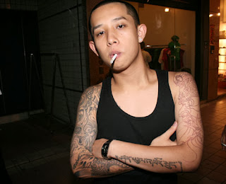 Name: Harry Tran
Age: 17
Occupation: Currently studying in college
Interests and hobbies: Football, games, music (mainly hip-hop), girls.
Ideologies (values and beliefs): He is a Christian, believes in the saying ‘you only live once’, or ‘YOLO’ as referred to by this day and age’s society. He lives in the moment and worries about the future when it comes. He values the respect and approval of those around him.
Plan for an artist:
Name of artist: Chip Chocolate
Biography: Chip Chocolate is a cocky and unique individual. Chip
Chocolate’s real name is Craig Jackson. Craig Jackson was born in Cape Town,
South Africa on the 12th of August 1994. His hobbies are football, rapping
and eating cookies. Craig Jackson didn’t have the most pleasant childhood. He
was involved in a gang in his early teenage years and when he came to the
decision that what he was doing was wrong, he had to relocate his life to
another country to escape the danger, eventually ending up in London, England.
Through his ordeals, Craig developed an attitude where he takes life with a
deadly seriousness, and so, his music refers to meaningful themes in everyday
life.
How the artist will be represented: Chip Chocolate will be
wearing quite urban and modern clothing, with his trademark accessory being his
chocolate chip cookie necklace. He will also be wearing a snapback at all times
to highlight the idea of him being a hip-hop artist and a rapper.
The artist will have quite a stereotypical personality in
some aspects in relation to the genre of hip-hop. He will be a charismatic or
cocky character who is full of himself and so you could say he will reinforce
the idea of how hip-hop artists are seen. However, chip chocolate’s music will
not be solely about girls and money like how most hip-hop artists nowadays are
portrayed. He will challenge this stereotype as his music will have more
meaning to reflect his views on the world, meaning he will rap about the
environment, racism and so on.
Friday, 11 October 2013
Britney Spears Images Analysed
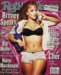 The front cover has been cropped around her in order to emphasise how she is the main focus. A high angle shot has been used. The purpose of this is to make her seem vulnerable, and on a slightly more inappropriate note, make out as if we are on top of her. Furthermore, her costume is very seductive on purpose, as she is hardly wearing any clothing. This is in order to attract more readers, mainly male, as if men see someone looking very lustful and attractive; they are more likely to purchase the magazine. Furthermore, a phone is used, which may convey the message that she is trying to communicate with us, or someone. It emphasises her being sexualised as the phone could imply her talking at night to a lover of such. A silk bed cover is used as a setting. This could be to add a lustful connotation. A pinkish colour is used to portray a girly and maybe immature connotation.
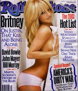 The image has been cropped from the top of her thighs and above. This shot is a medium shot. Britney’s costume is very seductive. She is hardly wearing any clothes and her pose includes her thrusting her buttocks out and pressing against a wall. This could suggest that she is looking for a sexual relationship with the reader. A bathroom is used as a setting in which the background is white. The bathroom could suggest that she just freshened up and so is clean. A high key lighting is used to set off a good mood. More people are likely to be attracted to a magazine if the front cover is bright, rather than it being depressing, or dull. The colour white is used in order to maybe highlight what is left of Britney’s innocence, or maybe just to show that she is very comfortable.
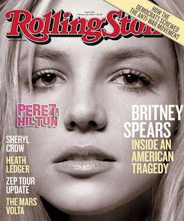 The image has been chosen to display a darker and more serious side to Britney Spears. The colours black and white are used to display a contrast between her personalities. The lack of colour relates to Britney, overall, being represented as sort of ‘lifeless’, or missing that certain something. The image has been cropped to show a close up image, which is used to highlight her facial expressions. Britney wants to relate with the audience and maybe have us sympathise with her. The text supports this as the word ‘tragedy’ is used. This indicates that this is more of a serious matter and one in which we should sympathise, and in some cases empathise.
Thursday, 10 October 2013
Focus Group Questions
This is the introduction for my Focus group. in this video, i introduced the people i was questioning.
This video includes my first question, which was in reference to how frequently my magazine should be released. Half of my focus group made it clear that they think it should be released every week in order to keep my audience from waiting. The other half thought that it should be released every fortnight so that i have more time to create and develop new ideas. I decided to agree with the two who said a fortnight. This is due to the fact that my magazine will be accessible online and so i don't have to worry about keeping my audience waiting.
In this video, i asked whether my magazine should be more glossy than serious, or more serious than glossy. everyone said it should be more glossy than serious, due to the fact that the magazine is being aimed to teenagers and so, needs to be anything but dull.
In this video, i ask my focus group if they think £1.50 is a reasonable price for a magazine and if not, what they think is a reasonable price and why. There were mixed opinions towards this question and so i decided to stick with the original price, as the group didn't say it was too much.
In this video, i asked if my magazine should be accessible online and what the benefits of this are. They all, unsurprisingly, said yes, with reasons being that it means more people will access my magazine
In this video, which includes my final question, i asked whether my magazine should be formal, informal, or a mixture of both.
This is the concluding scene for my focus group.
Monday, 30 September 2013
Survey Results Analysis
This shows that the preferred genre on average is rock and
that the genres that were chosen by the least amount of people were pop and
classical. From this, I've learnt that I should include mostly the rock genre
in my magazine.
This shows that the majority of
people do not buy magazines.
From this, we can tell that most
people would buy a magazine if it is between £1.01 and £2. This means that the
price for my magazine should be within this budget.
Most people, as shown in the chart,
prefer more images to text and so my magazine should include more images.
The graph shows that most people
think a magazine should be published every month. This tells me that this is
how frequently I should publish my magazine.
This shows that more people would
like the magazine to be accessible online, which is why my magazine will be
accessible online.
This chart shows that more people
would like competitions to be in the article than not, which is why my magazine
should include competitions.
Friday, 27 September 2013
Wednesday, 25 September 2013
Institutional Research
The
Bauer media group is an institution that focuses mainly on spreading media
throughout the nation. The media of which they spread is mostly based on music
varying in all different types of genres and styles and scattering them
throughout the airways through radio communications and through music magazines
that they make and advertise themselves. Furthermore, the
types of magazines the Bauer media group produce are, again, that of music and
different genres of music. This is done by the institution to broaden the
target audience of their magazines and increase the number of purchases for
their magazines by creating magazines that suit different people’s desires
across the country. It is through this that more money can be made because the
target audience for the many different magazines have been satisfied. Moreover, the
magazines that the Bauer media group produce are mainstream and niche magazines,
in which some magazines focus on particular genres of music and some focus on completely different topics such as bikes, cars and even bird watching
once again increasing purchases and widening the target audience accordingly. Additionally, Bauer
also gives people who are looking for work a chance to apply for a job in
advertising and earn some money. This job offer is centred on advertising Bauer
online through the use of online adverts and webpages created specifically for
the advertisement of Bauer. This gives unemployed people who have certain
skills a chance to have a job advertising for a large institution and get paid
for it in the process.
The institution
known as IPC Media is an institution based on developing their media and
expanding it through a larger audience. The IPC media institution create a wide
variety of media mainstream magazines and are most famous for their creation
and sponsorship of magazines such as golf monthly, chat and what’s on TV? These
different genres of mainstream and niche magazines widen IPC’s target audience
range and overall purchases for their magazine this is because with so many
magazines varying in genre and meeting the target audience for various
potential purchasers, people who want these type of different magazines will
purchase these, allowing IPC to increase their profits off the purchases. The majority of
this institutions target audience is made up of a variety of targets but mostly
those who read and like to find out about what is going to happen next week in
their favourite soap operas and sports magazines fans who want to find out
what’s new with the athletes and players that play that particular sport or
participate in that particular event. IPC media are linked
to other advertising types of media which allows them to advertise themselves
and their magazines or partner brands in a wide range of media products in
order to attract people and increase overall purchases, which increases profit.
Immediate media
is an institution that owns and constructs a vast range of media in the United
Kingdom. Immediate media own a lot of magazines varying from music to motor
sports. This gives immediate media a large target audience to meet but they
have met this with the large variety of media that they produce on a monthly
basis suiting the needs of thousands across the nation.
The other types
of media that this company own are actually television channels such as
Cbeebies and they don’t only own their own television channel that thousands
watch, but they own their own sponsored and created television shows such as
octonaughts, which feature on their channel Cbeebies. These different types of
media aim to suit the various needs of the target audiences across the nation
which means immediate media will gain an even bigger income from their works in
the media industry.
Development Hell
is a solo institution situated in Islington in the United Kingdom. Development
hell owns their own media products and tools and do not sponsor or invest in
any other type of media created by others. So far, Development Hell owns their
own self-proclaimed magazine that was supposedly voted the biggest music and
dance magazine in media itself. By allowing there magazine to satisfy two
different genres Development Hell has increased their target audience range,
which should increase the sales made by the company. Development Hell
has also worked with apple to create an app exclusively for the magazine they
own known as miximag. This app that they created allows users to access the
magazine online whenever they want to and wherever they want.
Subscribe to:
Comments (Atom)


