Thursday 17 October 2013

My Chosen Title Block


I've decided that this will be the title block for my magazine, even-though it was the second most voted for title design out of the four designs that I put up to be voted for. The reason why I’m choosing this over the most voted for design is that the winning design of the poll is displayed as ‘H.H.H’, instead of ‘Triple H’. I came to the conclusion that the title ‘Triple H’ would be catchier and more suited than ‘H.H.H’.

Tuesday 15 October 2013

Title Block Designs


Design 1


Design 2


Design 3


Design 4


These are the designs for the title block in my magazine.

Title Block Analysis


From the title above, it is made clear that the genre of music that the magazine will be based on is ‘Rock’. We know this because, the title of the magazine is ‘Rolling Stone’, which happens to be a ‘Rock’ based group. Furthermore, the colours used in the title are red and grey, in which red is the main colour and grey is used as the 3-D fill in the title. The colour red has been used to highlight the genre of music that the magazine is about. Red gives off connotations of danger and comes across as quite bold, which backs up the genre of rock. Also, the shade of grey in the outline of the title adds effect and helps the red in the title to stand out more. Moreover, the font used by the title appears as quite authentic through the flicks used in the letters ‘R’ and ‘g’. The purpose of this is to maybe catch the eyes of more people through the attractive font of the title. The font adds class to the magazine and might sway a customer’s thoughts into thinking that the magazine is of high quality. The title itself tells me that the magazine will clearly be based on rock related groups. This is due to the fact that the ‘Rolling Stones’ happens to be a really popular rock band. The title supports the genre of rock, as the title of a pop, or a different type of genre related magazine would not be named after a rock based group. Additionally, the title gives us the impression that the target audience of the magazine are rock fans, simply due to the fact that the name of the title is based on a rock group.


From the magazine title above, it is hard to tell what genre the music magazine is about as we aren’t given much information from the title. However, the colours used imply that the genre of the magazine might be pop. This is due to the colour pink being a colour mostly associated with pop, as oppose to other genres such as rock or hip-hop. The colour pink also tells us that the magazine might be quite feminine, seeing as pink is a feminine, or girly colour. Additionally, white is used for the solitary letter in the title to help both the letter and the background stand out. In addition, there happens to be quite a nice and attractive contrast between pink and white. Furthermore, the font used in the title is very bold. This could be to make up for the fact that there is only one letter in the title (Q), or in fact, to emphasise the letter ‘Q’. it could imply that the magazine will be quite bold. Once again, the title of the magazine doesn’t tell the audience much as it contains only one letter. In addition, it suggests that the letter ‘Q’ stands for something, and also, adds a certain air of mystery to the magazine as the audience might be intrigued by the single lettered title and so, want to find out more. Moreover, the magazine title gives us the impression that the target audience for this magazine are teenagers, who happen to be a huge percentage of the audience for pop. This idea is developed through the main colour of the title being pink, which could also indicate that the magazine is aimed towards females over males.


From the magazine title above, we get the impression that this magazine covers different types of music genres. This is because the magazine is called ‘New Musical Express’, which quite literally suggests that the magazine covers new music, whether it be rock, pop, hip-hop, or any other music genre. The colours used in the title font are red, white and black, in which the colour red fills out the letters of the title, while the outlines of the title are in white and black. This highlights the colour red mostly, which happens to give off bright, bold and sort of fiery connotations. Additionally, the white and black outlines contrast nicely, helping the title to appear more attractive towards the audience. Furthermore, the font used in the magazine is extremely bold. This makes the magazine stand out and implies that the magazine will be quite vibrant in its uses and detailed with effect. Moreover, the title of the magazine suggests that the target audience will be people who are looking for fresh, brand new music, as the title is ‘New Music Express’. It is from the title that we can make the assumption that the magazine will be heavily based on upcoming artists and new music.

Saturday 12 October 2013

Final Magazine Proposal

For my final magazine proposal, I have concluded that the title of my music magazine will be Triple H, or HHH, which stands for Hip Hop Haven. From this title, it is made clear that the genre of my magazine will indeed be Hip Hop, as hip hop is included in the title. The audience I will be targeting consists of a mixture of different age groups. I will be aiming the magazine towards teenagers and young adults due to the fact that they are the age groups most interested in the genre of hip hop. In reference to gender, my magazine will not be aimed towards either male or female in specific. It will be a magazine for both male and female as the audience for hip hop doesn’t consist of just one gender. After reviewing the responses in my focus group, I’ve decided that my magazine will be released every fortnight instead of every week. This is because I feel it will benefit me more if my magazine is released every fortnight due to the fact that it will give me more time to develop new ideas. The reason behind making the release date every week was in order to keep the magazine frequent for the audience and not have them waiting. However, seeing as my magazine will be accessible online, the audience will be kept up to date no matter what so it is ideal to release the magazine every fortnight. Furthermore, the reason why I have decided to create this type of magazine is because it is the type which I personally would buy. My target audience is going to reflect myself as it is aimed towards teenagers and young adults and mainly hip-hop fans. If I were to buy a magazine, I’d buy one based on hip-hop and one that is more glossy than serious, which is exactly how I plan to create my magazine. Moreover, I plan on including articles on hugely popular hip-hop artists in my magazine, such as, Eminem and Macklemore. This is in hope of attracting more readers who will without a doubt be interested in their stories if they are fans of hip-hop. Other potential contents for my magazine might be competitions of such, in order to stand out from the other magazines. I will attempt various techniques to attract the audience to the first edition of the magazine. To begin with, the front cover of the first edition will include the picture, or pictures of a popular hip-hop artist, in hope of attracting that artist’s fans to the magazine. Again, I will make it clear that there are competitions withheld in the magazine in order to show the audience what my magazine might have over others. Additionally, the colours used will be bright in hope of looking more appealing towards those who see it. Character profile of a typical person that would buy my magazine:
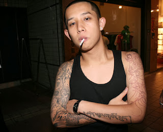
 Name: Harry Tran Age: 17 Occupation: Currently studying in college Interests and hobbies: Football, games, music (mainly hip-hop), girls. Ideologies (values and beliefs): He is a Christian, believes in the saying ‘you only live once’, or ‘YOLO’ as referred to by this day and age’s society. He lives in the moment and worries about the future when it comes. He values the respect and approval of those around him. Plan for an artist:


Name of artist: Chip Chocolate

Biography: Chip Chocolate is a cocky and unique individual. Chip Chocolate’s real name is Craig Jackson. Craig Jackson was born in Cape Town, South Africa on the 12th of August 1994. His hobbies are football, rapping and eating cookies. Craig Jackson didn’t have the most pleasant childhood. He was involved in a gang in his early teenage years and when he came to the decision that what he was doing was wrong, he had to relocate his life to another country to escape the danger, eventually ending up in London, England. Through his ordeals, Craig developed an attitude where he takes life with a deadly seriousness, and so, his music refers to meaningful themes in everyday life.

How the artist will be represented: Chip Chocolate will be wearing quite urban and modern clothing, with his trademark accessory being his chocolate chip cookie necklace. He will also be wearing a snapback at all times to highlight the idea of him being a hip-hop artist and a rapper.

The artist will have quite a stereotypical personality in some aspects in relation to the genre of hip-hop. He will be a charismatic or cocky character who is full of himself and so you could say he will reinforce the idea of how hip-hop artists are seen. However, chip chocolate’s music will not be solely about girls and money like how most hip-hop artists nowadays are portrayed. He will challenge this stereotype as his music will have more meaning to reflect his views on the world, meaning he will rap about the environment, racism and so on.

Friday 11 October 2013

Britney Spears Images Analysed

The front cover has been cropped around her in order to emphasise how she is the main focus. A high angle shot has been used. The purpose of this is to make her seem vulnerable, and on a slightly more inappropriate note, make out as if we are on top of her. Furthermore, her costume is very seductive on purpose, as she is hardly wearing any clothing. This is in order to attract more readers, mainly male, as if men see someone looking very lustful and attractive; they are more likely to purchase the magazine. Furthermore, a phone is used, which may convey the message that she is trying to communicate with us, or someone. It emphasises her being sexualised as the phone could imply her talking at night to a lover of such. A silk bed cover is used as a setting. This could be to add a lustful connotation. A pinkish colour is used to portray a girly and maybe immature connotation. The image has been cropped from the top of her thighs and above. This shot is a medium shot. Britney’s costume is very seductive. She is hardly wearing any clothes and her pose includes her thrusting her buttocks out and pressing against a wall. This could suggest that she is looking for a sexual relationship with the reader. A bathroom is used as a setting in which the background is white. The bathroom could suggest that she just freshened up and so is clean. A high key lighting is used to set off a good mood. More people are likely to be attracted to a magazine if the front cover is bright, rather than it being depressing, or dull. The colour white is used in order to maybe highlight what is left of Britney’s innocence, or maybe just to show that she is very comfortable. The image has been chosen to display a darker and more serious side to Britney Spears. The colours black and white are used to display a contrast between her personalities. The lack of colour relates to Britney, overall, being represented as sort of ‘lifeless’, or missing that certain something. The image has been cropped to show a close up image, which is used to highlight her facial expressions. Britney wants to relate with the audience and maybe have us sympathise with her. The text supports this as the word ‘tragedy’ is used. This indicates that this is more of a serious matter and one in which we should sympathise, and in some cases empathise.

Thursday 10 October 2013

Focus Group Questions


This is the introduction for my Focus group. in this video, i introduced the people i was questioning.


This video includes my first question, which was in reference to how frequently my magazine should be released. Half of my focus group made it clear that they think it should be released every week in order to keep my audience from waiting. The other half thought that it should be released every fortnight so that i have more time to create and develop new ideas. I decided to agree with the two who said a fortnight. This is due to the fact that my magazine will be accessible online and so i don't have to worry about keeping my audience waiting.


In this video, i asked whether my magazine should be more glossy than serious, or more serious than glossy. everyone said it should be more glossy than serious, due to the fact that the magazine is being aimed to teenagers and so, needs to be anything but dull.


In this video, i ask my focus group if they think £1.50 is a reasonable price for a magazine and if not, what they think is a reasonable price and why. There were mixed opinions towards this question and so i decided to stick with the original price, as the group didn't say it was too much.


In this video, i asked if my magazine should be accessible online and what the benefits of this are. They all, unsurprisingly, said yes, with reasons being that it means more people will access my magazine


In this video, which includes my final question, i asked whether my magazine should be formal, informal, or a mixture of both.


This is the concluding scene for my focus group.